Thursday, 17 November 2011

Show Piece

 For this task I wanted to exhibit something which combined the two workshops I had been working in, 3D and machine embroidery. I began by drawing with graphite, making energetic and vigorous marks, I then stitched into these paper drawings and stained them with tea and coffee to reflect the colour of the fabric I planned on using.


Trying to make the most out of what I had learned in machine embroidery I stitched heavily onto paper, I chose the colour blue as many of the photographs I had take of my jewellery had blue beadsas part of them.

In 3D I had been focusing quite strongly on the dodecahedron shape, I wanted to try and actually assemble them into the circle shape they are meant to be. I did this with the fabric nets, however, when I put them properly together I found they did not look as interesting as they did when they were half formed, allowing the viewer to see inside the shape. 

Once I had completed these three parts of my piece I connceted them together with white thread so they would be able to hang against the wall. Having put my piece up I am happey with how it looks, I think each part reflects a different part of my project showing my strengths and new tecchniques I have learnt.

Wednesday, 16 November 2011

Dodecahedron Costume


I got to the point of looking at the dodecahedron shape by previously having tried to make spheres and balls out of fabric and paper, however this was not very successful, and they looked more like crumpled flat ovals. The dodecahedron is a shape made up of 12 hexagons whcih when put together forms a honeycomb, circle shape.


I began by drawing out the net out onto card and then tried to assemble it, this was prooving difficult as the sides would not stick together properly or securely. Fuortunatly I think the net looks just as interesting half formed as it does fully formed. I started pinning it to a manaquin in a over the shoulder dress kind of way, making certain parts raised and others flat.


Getting the card to stay in place and mould the right way was more challenging than I expected, I think due to the stiffness of it, however I think in some parts it has been effective in making a 3D sculptural shape.


Having struggled with the hardness of the card I began to work with fabrics, I chose much lighter colours than the card hoping to achieve a more elegant feel.


Working with fabric started out more difficult because cutting a precise net washard when the material kept fraying, but once all the pieces were cut in different sizes, pinning and moulding them to the manaquin was much easier. It was quicker to manipulate them in the way I wanted, making some parts raised and others flat. 

 
I quite like the overall finished look on the manaquin, I think the shapes that have formed are quite interesting and the layering of each fabric compliment each other. 

Tuesday, 15 November 2011

Iris Van Herpen


Having seen the presentation at the beginning of the 3D workshop, the designer, Iris Van Herpen really stood out to me, I loved the use of shapes and sculpture together. The shadows these designs make are really striking in my eyes, each design creates different ones when the model moves.


In the pieces above I really like the exagerated shapes and the way the fabric has been manipulated to form a sculpture type design. The fact the dresses have been made in a white and grey (quite basic colours) allows the forms to speak for themselves instead of letting colour steal focus. 

The circle design is something I am quite interested in, I hope to research this futher and maybe experiment making my own circles. On the skirt above also, I think the use of materials have been chosen very well, the see through plastic strands are powerful because of the way they project outwards but also subtle in a way because they are transparent. 
The dress above is one of my favourite from the collection, it is so delicate and intimate looking due to the fact there is not much there. But I think the sharp points and edges give the piece a strong look too. The contrast of strong and sensitive in the same piece is something I generally always like as I think it is quite difficult to achieve.


Louis Vuitton Spring/Summer 2012

Whilst on the i-D website I came across the Louis Vuitton Spring Summer 2012 collection. I was drawn to it not only because of the unusual stage props (carrousel) but becasue of the use of white and other pastel colours. Using only white I think is effctive as it lets the designs speak for themselves and gives them a clean, minimalistic backdrop so they can stand out. 


 I love the pretty girlyness of the pieces all of which have a classic and feminim shape to them. The skirts and dresses are all cut to nip in at the waist and then poof out underneath.I think the flower cut out pattern on the pieces ties in with the girly feel that all the dresses have.

The idea of the models riding on the carrousel I think is a wonderful idea, it gives the audience an original show and allows them to see the collection from all angles. However, I think the models may have struggled getting off and on the carrousel gracefully in heels.

The dress above on the left is my favourite of the collection, I love the shape, layers and use of holes and gaps in the fabric. I think even though there are bits of fabric cut out it still has a very elegant feel.

Monday, 14 November 2011

Sleuths, Spies and Lies

For my project I chose to research Afflecks Palace, I began by going there and taking photographs and picking up leaflets and fliers. I hoped this would give me a good start to the project, with lots of visual research.

 When arriving at Afflecks Palace my first reaction was how striking the metal decoration on the outside of the building is. I love the way the branches and leaves swirl round the bricks and windows. Having this decoration catches peoples eyes and draws people inside.

When I entered the building I was surprised at how colourful and lively it was, the walls were covered in posters and paintings. I hoped this would give me lots of inspiration futher into my project.

 
I loved the busyness of the stalls and shops, each one provided something new to look at . In the photogrpah above I think the bike and lamp add a homely and original effect to the shop, you would not find things like that in River Island or Topshop. 


 Another thing I noticed on my visit were the people, at first I felt out of my comfort zone as a few of them looed alternative, but once I spoke to them and asked them questions, everyone was really friendly and helpful. I think the different styles of people who go to Afflecks Palace would be an interesting aspect to look at as there would be a wide selection. 

 
 A shop which caught my eye instantly was the bead shop (photograph above) all the beads were colour co-ordinated and put together so well. Id like to look into this futher as I think it will offer a big range of options of which direction to take my project in, with a textile element.

Large Scale Drawing Task


 The images above show the steps I took when creating my large scale drawing. In the brief we were given a list of requirements- the drawing must be no smaller than 1m X 1m, must be in black and white and the subject matter must be taken from the origins brief. I decided to draw from some photographs I had taken previously of jewellery inspired by bead shop in Afflecks Palace. I used graphite, oil bar, paints, charcoal and a rubber to create my drawing. I wanted it to be powerful and bold, I think the technique I used with the rubber worked well to illustrate energy and movement. The drawing itself could easily be improved by concentrating more on smaller details instead of just the large outline of shapes. I found it a challenge working on such a large scale as I much prefer to work smaller and more delicatley.Once I started my drawing I enjoyed making it, deciding which media complimented each other, putting strong marks next to sensitive ones and seeing the final outcome.

 
The next part of the task came as quite of a shock to me, we were instructed to destroy/reconsruct our drawings. Having spent some time creating the piece the idea of taking it apart did not fill me with joy, however once I started I really got into it. The pictures above and below show my stages again, of how I started by tearing my drawing up and then crumping the pieces to try and make it more 3 dimensional. I think the image of just the torn up piece is one of my favourites as it shows that art does not need to be perfect and complete to look good. I enjoed pieceing the torn paper back together in a new and more interesting way. I liked how some piece of paper began to curl and create new shapes. 


 When I turned the piece over I found that the reverse side was quite pleasing too, the white paper had now gained smudges of black and the layering was making some new shadows and shapes.


The images above show my final piece and close ups. When I attatched it to the wall I wanted it to look more sculptural so I tried to make it come out. I think the way the light is hitting it at the top is quite beautiful in comparison to the shadows forming underneath. Im glad we had to deconstruct our piece as I think mine is much more effective and unique now than when it was a flat piece.

Monday, 7 November 2011

Task 2


When beginning any drawing I generally feel a little reluctant and negative to how it will turn out as it is not my strongest skill. However, from studying at Manchester Metropolitan University I am trying to change my way of thinking, everyone can draw it just takes practice.

Looking through my sketch books a pattern I see emerging is I generally draw after being inspired by an artists’ work, not from seeing something and wanting to draw it. For example the piece below I think is drawn in a similar way to how Claude Heath draws as there is a repeating pattern of marks, all being quite fluid and energetic.


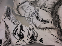
The painting above has been created in a similar style to how Jasper Johns works, both using thick black and white paint. The thickness of the paint is important here as it gives the paper a new texture. 


Attending the drawing workshops has been vital in helping me produce my work; they have given me inspiration and new ideas in how to work and which media to use. Whilst taking part in the workshops I have been able to experiment with oil bar and graphite. Both of these materials are fairly new to me and I have never felt fully confident when using them. 

After using graphite, I really liked the energetic and bold marks I could make. In the piece above I drew from my visual research of black and white photographs of jewellery. I like how strong some marks look in comparison to some of the fainter, sensitive marks.

When starting any drawing if there is a large blank piece of paper I tend to panic, not knowing what to draw, worrying about how it will look. I much prefer to work on a smaller scale making my marks more detailed and less obvious. But having now drawn on papers of various sizes and shapes I feel more confident in doing this in the future. Although I probably will always prefer to draw at a smaller scale I feel i can face the challenge of drawing largely if necessary. 


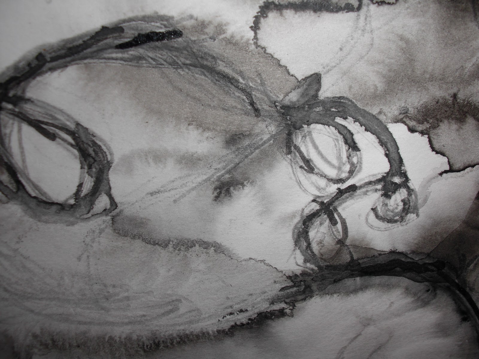
The piece above was drawn from using ink and a stick. The marks which emerged are slightly accidental as the water ran spreading the ink. I think this creates a interesting effect, as you would never be able to achieve the same mark twice when using this technique. 

After having looked at other peoples sketch books it is clear at where I need to improve, I need to make a clearer link of how I have got from one idea to the next, so people can follow my thought process. The speed at which I work also needs to be quickened, I have always worked in a slower more thoughtful way, I intend to still work thoughtfully and sensitively but will definitely try to be much quicker and produce more work.